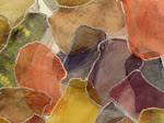
+by+Nick+Volkert).jpg)

Kristin Reger
The word opportunity seems to have all but disappeared from our vocabularies this last month. It is as if in a matter of weeks the sun has stopped rising, the pen has run dry, the paint has stopped flowing, and all resemblance of common sense has gone the way of "The Market". Where do you go when all else seems lost? What did you find yourself doing last week? I found myself digging a little deeper and trying a little harder to find the essence of creativity. I wanted to swim in color. I wanted to swim away from all else and drive deep into the freedom and life flowing from the brushes and voices of the independent artist.
I turned to Chicago's Kristin Reger. I had seen her work prominently displayed on the front page of a friend's website, and it really lifted my spirits. Kristin works mostly with fabrics and a bright mixture of colors. Her work has been shown across the country, and with high regard in Argentina. She experiments with structure and texture, and pours every bit of her creativity in into her art to create her own opportunities.
Kristin was kind enough to answer a few of my questions.

Orange Alert (OA): How would you describe your work?
Kristin Reger (KR): Spontaneous, decorative, inspired, bright, rhythmic, organic, detailed, obsessive, tactile, psychedelic. I’m heavily experimental with materials and set the boundaries only at the paper’s edge or cloth’s seam. While I work in two, sometimes three dimensions, I approach further dimensions within those constraints. The process involved is beyond my understanding, but has evolved from a freeform, tantric practice - I draw and paint; sew and print, and possessed by the movements. Everything is bright; everything moves.
OA: I have always enjoyed the texture and look of mixed media paintings. What are some of the things you have added to your pieces? Do you have an idea of what you will add before you begin?
KR: When creating a piece, I don’t plan the composition much. No mater the media, I always rely on two things: a tight color palette, and organic line. I have a strong idea of the materials I want to use beforehand - when one works with media ranging from dainty beading and gold leafing to industrial dyes and epoxy resin, it’s necessary to check in with past successes and failures. Mostly borne of trial and error, I consult my arsenal of materials that mesh and repel, making sure not to go too far where things will corrode one another, muddy colors, or even have destructive chemical reactions! I like to think of myself as an alchemist, but really, the materials I use are pretty tame compared to someone working in metals or ceramics. My favorite material is fabric, so I use a lot of traditional binding and dying techniques to create my paintings; likewise, much of my drawing inspiration derives from textiles patterns.
My production process is important and has matured from unfettered experimentation to a more archival and professional final piece. The first big piece I sold was made with hot glue and vinyl. I didn’t think too much about how it was going to last, I just needed to get the idea out as quickly as possible. Soon after it was sold, one of its counter-parts was falling apart. I called my patron and said, “Can I have that piece back to do a little… um… reinforcing?” Luckily she was cool about it. I stitched everything down, and have since considered permanence in my production. Still, I’ve moved toward installation, perhaps as a way to avoid dealing with the ‘monumental object factor.’
The newest pieces I’m working on are two divergent projects, but both resulted from a residency I attended in Argentina. First, for Around the Coyote, (where I’ve been awarded Curator’s Choice), I’m reinterpreting an installation I did for Otro Nudo, the solo show I had in Argentina. Inspiration for this piece came when I saw the Hyperbolic Crochet Coral Reef exhibit in Chicago last year & wanted to see what I could do with that craft. Otro Nudo became a compulsive endeavour of building this nest around me, thus making the name (which translates colloquially to another mess or another bind) perfect! It grew into a crocheted spider web/chandelier thing that cast beautiful, eerie shadows. I traced the shadows and then switched the lighting, further nailing down ideologies developed with the binding / dyeing / painting work I’ve been known for. Creating the piece unveiled my artistic motive: I create a structure, build integral motifs of pattern and color in direct response to that armature, and then destroy the original croquis so that nothing is left but the shell. This process plays into ideas about memory, interpretation and re-creation, but the results are also decorative. Thus, my art is both presentative, (in being superficially pleasing), and denotative of its own (perhaps greater) definition & reinterpretation.
My second project further taps into this “shell and shadow” theme: a series of oil paintings based on mid-to-late 20th century housing skyscrapers. They’re concrete and very sparsely dotted with windows, and everywhere in Argentina. I liked them in the sick way that people sometimes like industrial scenes: because they’re alienating and so distant from reality. This type of building is not exclusive to that part of the world, so I did a little more research and found Michael Wolf’s photography of Hong Kong; the vertical favelas in Brazil; Chicago’s own Cabrini Green residential projects; and revisited the photos I took in 2003 of the socialist architectural disasters of the Netherlands. The repetition and scale of it all is unbelievable, but I like when the human elements shine through - clotheslines, graffiti, non-matching windows. The buildings are so massive that their inhabitants are obscured, making the buildings seem like a living ghost town. I’m reintroducing the human element through a decorative, embellished, and abstract interpretation. The series is called Impossible City. I’ve never worked in oil before, so it’s exciting to approach a traditional medium with an irreverent, experimental background. It’s also fun to have 8 pieces all growing and developing slowly and simultaneously - I usually work on one piece at a time, two at most. It’s also been humbling - I’m used to working fast and with materials that allow instant gratification, but oil demands full and absolute patience and attention. It’s also the most reverent, scholarly subject my work has ever breeched, sometimes making it challenging to work on!
OA: Many of your pieces look almost like they are tie-dyed. What is your process for preparing your canvas, and how do you get your colors to mix that way?
KR: Canvas is cloth and it always made more sense to treat it that way. My artistic points of reference when I began to make art full time were fashion and sewing courses, so it made more sense to tie up, stitch, and dye not only canvas, but many different fabrics. I experimented with many surface design techniques, and fell in love with marbling, which is the process of floating paints on water to make very fluid designs. The round silk pieces I have are all marbled, with embellishment. I’ve definitely used tie-dye and grew up doing it. Last year I studied arashi shibori - a form of Japanese tie-dye, where you bind fabric on a cylinder to make stripe patterns.
To get my colors to mix, I again rely on materials: water-based, solvent-based, and oil based materials together. The secret is not in the mixing, but repelling, to achieve the chaotic patterns in my pieces. The best insight into the pieces you’re referring to is a list of the tools used:
Markers: Le Pen by Marvy. The ultimate line. Forces the artist to be light because the tips are delicate. Also, Letraset’s discontinued Pantone markers are divine, but their new line I do not endorse.
Paint/ Dye: Dr. Philip Martin’s concentrated watercolor, Holbien water mixable oils, Pearlescent ink, pretty much anything Jacquard makes- mica pearl pigments, acid/ heat dyes, weird resist products.

OA: Since you work with fabric often, have you considered making custom t-shirts or bags?
KR: I tortured myself with start-stop steps toward fashion and textile design for a long time, and much of my education derives from these relinquished paths. Making bags or shirts as an alternative method of promotion is a great idea, but I don’t have the time or energy to pour into that as a separate venture. Past experience has taught me to not bastardize my passions and talents in compromised incarnations of my ideas. Staying true to heart keeps one’s vision clear and pure, making its translation into existence effortless. That said, collaboration is important for growth and I have done work before where I’m just doing the drawings and other people are translating it to bag, shirt, whatever. For now, I don’t feel compelled to move in that direction, but am open to alternative & fun ways of generating income and diffusing my work once my straight artistic practice is more established.
OA: What are your thoughts on the Chicago Scene in general? Are there opportunities out there for young artists?
KR: Objectively, Chicago’s ideal for an emerging artist, considering the balance of cosmopolitanism and affordability. Of course, it doesn’t have the cachet of New York or LA, and Chicago is seen as not having as many ‘breakthrough’ opportunities ‘to make it’. I grew up in Chicago, so I have the added battle of feeling the need to break away. Still, it’s easy to make a living here doing what you want.
The Internet has definitely changed the need to physically be present anywhere for opportunities. That works both ways for Chicago - people can live here and find exhibition and funding opportunities elsewhere; likewise, city-backed sites like chicagoartistsresource.org bring our opportunities to a larger audience, opening up the city to more talent and notoriety.
In regards to the ‘Scene’ here, I see Chicago having 2 visual art scenes, both incredibly strong: first, the gallery-based, grant-funded, MFA-educated, established-and-official Chicago Art Scene; second, the undercurrent, mostly composed of younger people who make and consume art tied with DIY ideologies, pop culture and music. This is a generalized dichotomy, and while not mutually exclusive groups, there exists a real, difficult gap between emerging and established. Sadly, it’s hard to be taken seriously if you subscribe exclusively to the latter and hard to break into the former.
As I mentioned earlier, I was recently working in Argentina, and there it’s a different story. I was in Buenos Aires during Arte BA, (their annual art fair that parallels Artropolis or the Armory in size and magnitude). There were the collectors’ galleries, bringing big names from all over the Americas and Europe, but right next to them were some unbelievable galleries taking a gamble with younger, lesser-known artists. One of the hottest galleries there right now is Appetite, showing a clusterfuck of electroclash porn imagery. In fact, they actually have an erotic store apart from the gallery. Another, Juana de Arco, is a ‘younger’ but very well- respected gallery in the Palermo neighborhood of BsAs and also owns impeccably decorated lingerie/ women’s wear boutiques in Santiago and Tokyo. A quarter of the exhibition space at Arte BA was dedicated to startup galleries, alt. spaces and individual artists. Inside and outside the event, the rules were much more flexible and the lines between official and initial refreshingly blurred. Artists were not represented by one gallery within 100 miles, but as many that wanted to show them. Through Arte BA, I had the opportunity to show at a gallery that really suits my work, Jardin Luminoso.
To put my point into acute focus, last year’s Artropolis saw organizers from Lumpen Magazine/ the Co Prosperity Sphere storming the Merchandise Mart in Roman gladiator garb. I can appreciate rejecting the commercial art establishment with performance, but in comparison to the more integrated art world in Buenos Aires arises the question, is the ‘alternative’ versus ‘commercial’, us-versus-them mentality necessary? Art is recognized as a commodity long before cultural capital in the US, and in therein lies the intrinsic problem marginalizing young artists: they’re unsafe, under-developed investments for commercial galleries and often too subversive for serious public funding. So yes, that sort of countercuture/underground action is somewhat necessary here, and is part of what makes our pop culture so interesting and appealing. As for showing in Chicago in a commercial gallery, I’m finding from more established colleagues that years of building trustworthy relationships with gallerists is the standard career path. But there are always exceptions and other ways to achieve success. I’m still very outside of the commercial gallery system and prefer to focus on developing my work and showing at places I find encouraging and inspirational. All of that aside, I do believe there are ample opportunities to gain exposure and develop professionally in Chicago.
OA: What's next for Kristin Reger?
KR: I think its important to spend some time in New York City to expand my horizons and repertoire - in part so that I can better understand that big mysterious mess that is the art world and where I want to fit into it, but also so I can take advantage of classes, exhibitions, lectures, etc. that are unavailable here. I am still interested in textiles, and New York has more going on in that department. Like a lot of other artists, I’ve thought about moving there and this is a test period for that too: NY occupies such a huge place in the American, (and particularly artists’) psyche; it’s a sort of hiatus to exorcise a demon, or to quench a somewhat irrational thirst.

Bonus Questions:
OA: What was the last great book you have read?
KR: La Danza de Realidad by Alejandro Jodorwosky. So inspirational and bizarre. Arthur Magazine released a translated excerpt from another autobiographical book he has, which while more exaggerated in its style, is similar. It will make you want to go to Mexico City right now!
OA: It's clear you are a fan of Magical, Beautiful, but what are a few of your other favorites?
KR: I work purely visually, but my inspiration is 100% audio. Please keep in mind, I’m the sort of person who listens to the same single 80 times in a row. If it’s good, just stick it in my vein:
Lindstrom, LCD Soundsystem (still), Sparks (Kimono/ No. 1), Studio, Ariel Pink, Cut Copy, Devendra, Joanna, Hercules, Herculaneum, Erasure (serious), Broadcast, Emahoy Tsugué-Maryam Guèbrou (any Ethiopiques), (Berlin) Bowie, Lee Scratch Perry (now), Mercedes Sosa, Cactano Veloso (Brazil ‘67-‘73), Extra Golden, High Places, Tuvan throat singing, Acid Mothers, Kraftwerk, Can, all that stuff
By the way: Magical, Beautiful is touring Midwest/ East Coast right now.
For more information on Kristin Reger please visit her website.


1 comment:
Excellent and in-depth...
Post a Comment